
Merge; A fleeting moment
Introduction
Hi, and welcome to Behind the Bottle! This will be a space to share behind the scenes information about Redolescent, and our perfumes. There is so much more to the story which happens behind the bottle!
The Inspiration
Back in the lockdown lifting of 2020 my mum and I escaped on a holiday to Wales (holidays which have now become a sort of annual tradition with my mum and her dogs). By chance we happened upon a nice little Air BnB space which allowed for my mum’s 2 Springer Spaniels – finding somewhere to stay with the dogs was more important than the actual location for us! It was akin to a static caravan on a little holiday park in Llanarth; quiet, secluded, perfect!
We spent the few days exploring the local area, walking with the dogs, and finding as many beaches as possible. We samples numerous ice creams, fish and chips, and even knocked together a bit of a rubbish meal with the available cooking facilities and limited on-site shop. I think it was a sweet and sour chicken with microwave rice. Either way, it was quality time with my mum doing what we do best; laughing.

The holiday park
I was working towards the re-launch of Redolescent (the first launch is a story for another day…) and was working on a completely different collection of perfumes at the time. Creative block had been setting in, and the pressure of ‘trying to get them done’ was taking its toll. 30+ versions for one of them (and still counting by the way…) and It still wasn’t right. The holiday served as a nice release from this, a chance to reset and recharge.
The final evening of the holiday came around and we decided to take a walk down the beach at Aberaeron to tire the dogs out a bit before we sat down for a reservation at a restaurant around the corner. We were sure to find one where we could sit outside with the dogs. As we walked along the beach, looking at the cairns people had made, and the wave breakers going out into the sea, I noticed something I’d never seen before. The colour of the sky seemed to match perfectly with the colour of the calm sea. Looking out towards the horizon offered an endless expanse of blue in a way I’d never noticed, or maybe appreciated, before. A spark! A fleeting moment of “I wonder” hit, and the creativity I had been missing started to whir into life. The question was simple: “I wonder what a perfume would smell like if it merged seamlessly from start to finish”. In hindsight, a bit of a silly question, because many well blended perfumes do that. But, I had been working on fragrances with such strong identities and ‘spotlight notes’, so it was all the permission I needed to give myself…
“What if…”

Beach at Aberaeron
The meal itself was lovely, as I remember it. I definitely had mussels (to the protestation of my mum) and an espresso martini accompanied the meal at some point. We were sat by a large pond and there was an injured bird that a member of a local charity (and numerous well-meaning members of public) spent the full meal trying to catch. It was light entertainment for the meal, and the bird was still evading her as we left for the evening.
The creative process
The “what if” question didn’t leave so I decided to take a break from the fragrances I was working on and just work the idea through: experiment, learn, and explore.
I was sure that there needed to be a beachy aspect, to reference the walk which inspired it, so that is where I started! There are a number of typical ‘marine’ materials in perfume which I could draw from, but I kept the choices simple and streamlined. Too many different materials would give ‘bumps’ over the lifetime of the fragrance, and I wanted to keep the overall journey smooth as it transitioned over the day. Seaweed absolute was a must, though, as I like the funk it brings, and immediately plants you by the sea.
I don’t remember why I chose to make Merge an amber specifically. However, I remember choosing labdanum and cashmeran specifically for their ‘texture’. Cashmeran, in particular, is very ‘grainy’ to me, very similar to the feeling of sand. Not individual grains, but a full beach worth that you can sink your hands into.
I think this was the time I experimented with a material called Precyclemone-B (in both Merge and Hide). Ozonic, radiant, fruity – it sounded perfect – but it was an immediate regret. I blame myself, not the material, but it wasn’t working for me in this context. Admittedly, I haven’t reached for it in my experiments since, either.
There became a point in the development cycle where the ‘backbone’ of Merge was done, but it didn’t have the full personality that it needed. It needed a bit more dynamism, a sun in the sky, or some waves in the sea. Here the development path diverged, I remember recording them as “Merge Blue” and “Merge Orange”. Can you guess which one escaped the lab and became the Merge that you know today?
Some of the materials I experimented with for Merge Blue were mint, camphor, and lavender.
Merge Orange is where the citrus note came in – made of sweet orange, bergamot, and yuzu aldehyde. Petigrain was once in there too, but got dropped along the way. After another few tweaks, and much to my surprise, Merge was ‘done’. The experiment which was answering my question of “what if”… The experiment which was providing creative freedom from the collection I thought I was going to launch… That experiment turned out to be a part of the trio of fragrances which re-launched Redolescent, and helped me to define what the brand stands for today.

Original notes showing formulations of Merge Orange and Merge Blue. I still have the original "Merge Orange" trial bottle.
Bringing it to life
In order to tell the story beyond the bottle a few more pieces needed to come together: the packaging and the cap! (The name was already set in the instant that inspired it).
The cap was the hardest to design of all of the launch trio. The other two, Hide and Hive Mind, had literal answers to the question. But Merge was capturing something else; a serendipitous moment and a feeling. I toyed with the idea of a cairn bottle top, but practically it wouldn’t have worked well (it needs a hole big enough for the cap to fit, and it would have pushed the proportions off a bit, I think). So I landed on the idea of a sea tumbled stone. The kind that you idly pick up and roll through your hands while thinking or reflecting. It had to have smoothed edges, like it had been tossed by the sea. Something with life, history, and memory.
Taking this idea further, I asked the designer to experiment with the idea of imprinting that moment, that memory, into the stone itself. What if that moment in Aberaeron were carved into the stone itself? A moment in time, permanently etched into the stone. A memory forever captured. I don’t fully understand it myself, but something appealed to me about the idea of a fleeting moment being able to be captured in such a way. A flashbulb memory, captured in stone.
The designer was brilliant and managed to execute this perfectly. The cap for Merge suddenly became my favourite of the 3, although they all have details which I enjoy.

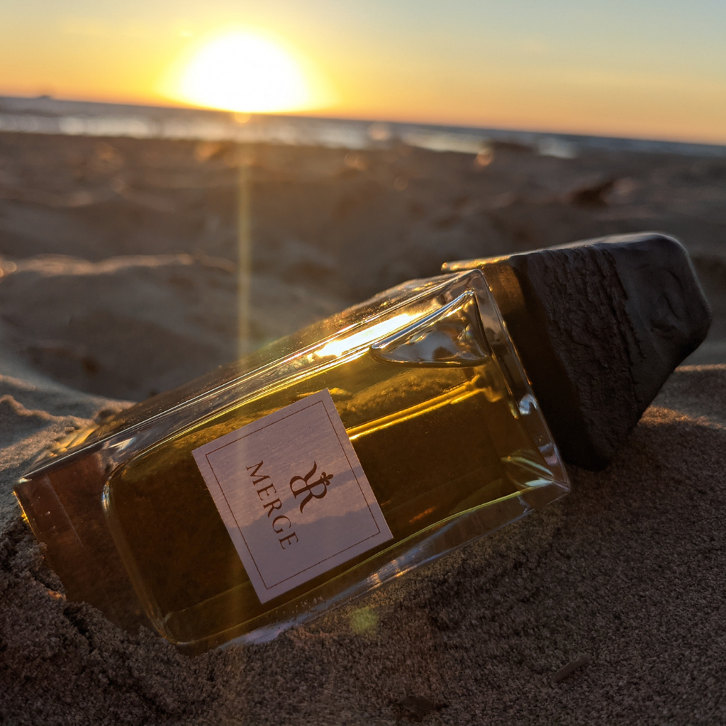
The cap for Merge
The final change was a practical decision. I was concerned that the tapered top would be difficult to grip, particularly with wet or weaker hands. So, I asked that we put two subtle curves into the sides, somewhere for the fingers to naturally sit, and an anchor point to lift the cap. It is nice. For me it ‘finishes’ the cap nicely, makes it pleasant in the hand, and easier to use. Feel for it when you next hold the cap of Merge. It is subtle, but it is there!

A place for fingers to rest
For the packaging I opted for a nice beachy beige to become the colour of Merge. The second choice would have been a misty blue. But, Hide was on the horizon which took the crown there! Plus, Merge doesn’t ‘feel’ blue for me.
The poem inside the box was kept simple and reflective, too. Merge for me is unfussy, it speaks to those simple moments in life which remind you of the beauty around you, and offer those moments of awe and wonder.
Leave a comment