
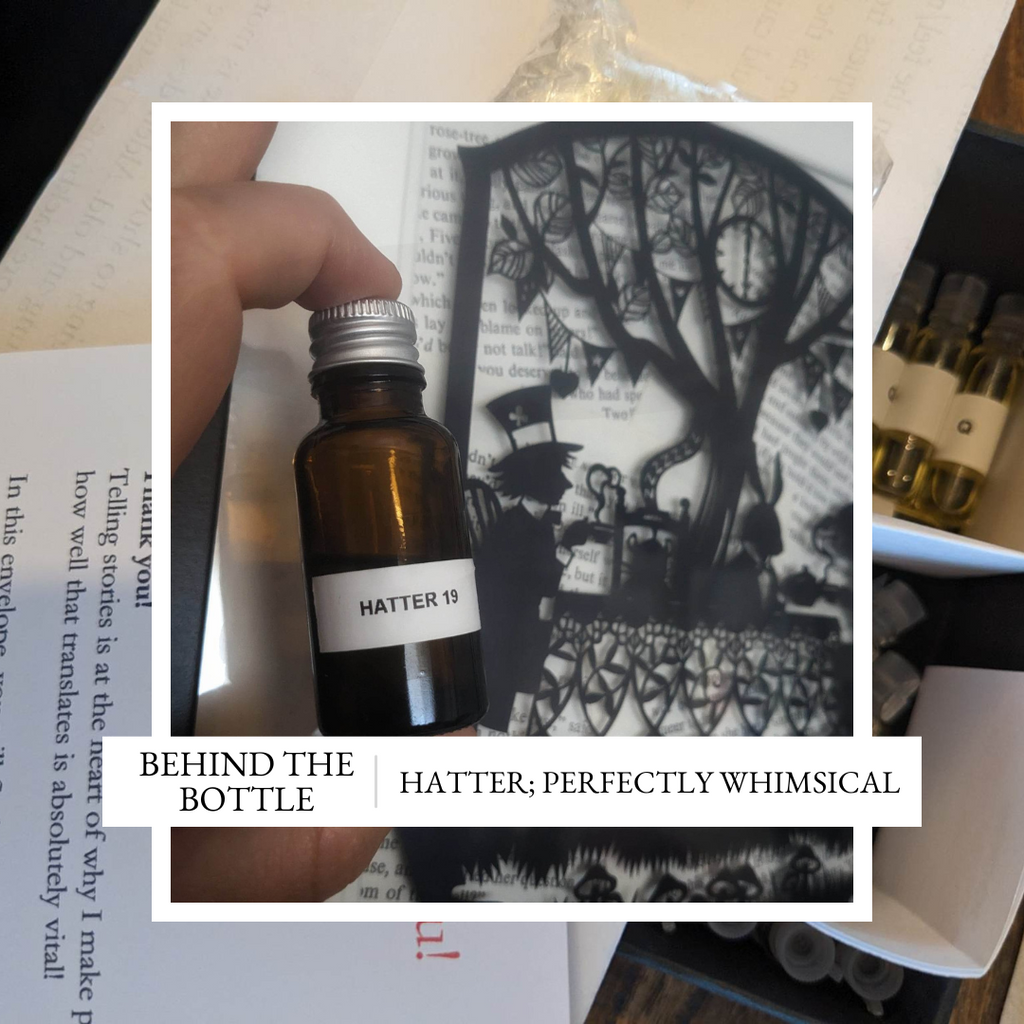
Hatter; Perfectly Whimsical
In part 1, I shared the “why” behind the Alice collection, and gave an insight into what to expect from our 3 leading fragrances.
Today’s instalment will cover the creative process of bringing Hatter to life, and yes, there might even be a sneak peek of the new cap design!
Setting the creative direction
Hatter, ironically, has the most ‘direct’ vision of the 3 (albeit the last one which was ‘finished’).
You immediately think of a tea party, right? It turns out that I didn’t find tea that straight forwards, especially not in the context I was working on. The problem with tea is caffeine; something which is quite heavily restricted in perfume. The original tea materials I was using just weren’t acceptable at the levels I needed them to be. They quickly lost character to the rest of the composition. But, there was no doubt, tea needed to make an appearance.
Strangely, though never mentioned in the books, Earl Grey Tea felt like the choice. The addition of the bergamot is quite forgiving, too – it fills in some space at the start of the perfume, and helps build the blank space around the tea note, making it feel more real.
Let’s look around the rest of the table… Cake was an idea that I worked on for quite a while. Ginger cake and vanilla sponge were the two main threads I followed. Eventually, the cake was dropped in favour of pulling into the leather direction more. I remember one of the original cake mods coming out with an almost plasticine type smell; interesting, but not what I was going for.
Still, a tea party without food isn’t much of a party. That’s when cucumber sandwiches appeared! Delightfully twee, I thought it would fit quite well. The problem was, we now have dry, hay-like tea with wet and squelchy cucumber. Texturally there is a clash there, so work needed to be done to help them not feel too much at odds with each other.
A material, undecavertol, originally bridged this gap. It smells of wet violet leaf and general mushiness. It dragged that wet feeling of the cucumber right through to the base of the fragrance. If I’m honest, it started to feel a bit queasy, so it had to go. This problem ultimately got solved when I started working on the next aspect…
Why was the Hatter mad? Probably mercury poisoning…
I love a bit of ‘darkness’ in perfume, the extra layer to the narrative.
I always saw the Hatter as a well-meaning, but slightly troubled character, and I wanted that to show with the choice of notes. That meant not shying away from the macabre, and building in a ‘nod’ to the reality of the situation. I’ve never smelled mercury. I’m not sure it would have much of a smell. In fact, if it is vapourised to the point you can smell it, there are probably bigger issues at hand.
Rose Oxide is notoriously metallic. It also has a wetness to it, even a ‘green’ edge. It turns out this astringent beast worked quite well to add a metallic screech (either of the mercury, or the Hatter’s shrill cries, you decide…). The contrast between the conventional and unconventional was growing, and the wet and dry halves of the fragrance were becoming further divided.
To finish rounding out the composition, the fabric/leather was required. I was imagining bolts of cloth; animalic felt with a leather edge. This actually sat quite nicely with the tea too, back on the drier ‘hay-like’ side of the fragrance. Safraleine added warmth, and even a bit of tobacco absolute to keep pushing right through into the base of the fragrance.
The shrill opening with the metal and cucumber is fleeting, and just like the character himself, the apparent rudeness soon gives way to a much warmer heart, that while unconventional, can still feel quite comforting. A fitting tribute, I hope, to a character who sparked a love for the entire story.
Choices choices… Packaging.
I’m not ashamed to admit that I actually quite enjoy this step of the process. I use paper from G.F Smith in the UK, which is then printed by Windmill Printing up in Scotland. Getting paper samples from G.F. Smith is like a mini-Christmas. Pulling together the options, contrasting them against the colour choice of the main box, and then bringing them together as a collection. It is a lot of fun!
I’ve never really been adept at colour pairings or graphic design, so I do consult a lot of people around me for their opinions on this step. Maybe that is why I enjoy it so much, the perfume design bit can feel quite insular, only popping your head up for feedback occasionally. In this step, papers are scattered across the table and we pair, swap, and contrast them, all while sharing opinions and opening debate.
G.F. Smith has a lovely paper with a leather texture which would have been my primary choice for the collection, but it is very thick, and colour options are very dark. This, unfortunately, leads to practicality questions for the packaging! Maybe it could be printed in metallic ink to show up against the dark background, but then there is the question of whether it will stand out in an odd way against the rest of the collection.

Ultimately, I played with both colour and texture for Hatter – opting for a nice, light brown which sits alongside the choices for QH and Alice well, while still capturing the essence of both the colour of tea and light-tanned leather.
Inside the box, the information card has the iconic quote of “Why is a raven like a writing desk”, a riddle which Lewis Carroll originally didn’t anticipate an answer to, his answer of "Because it can produce a few notes, tho they are very flat; and it is never put with the wrong end in front!" was only retroactively written when he received so many letters asking for the answer…
Cap design!
10/6!
I cannot tell you how difficult it has been keeping this quiet. I love the cap design for Hatter. Perfectly whimsical!
While it feels like an obvious choice, the cartoonish proportions and flowing shape are just so full of character. Look closely at the cap, you will see the attention to detail, too. Stitching along where the top joins the sides, and the folded fabric banding around the base of the hat brim. It really is a beauty!
When I was first testing the idea of 3D printed caps, and choosing the bottle shapes, I used a 3D model from the internet to start to envision how it might look.
The designs have come a very long way since then!

Leave a comment